
5 CSS Hacks to Add Digital Dopamine to your Squarespace Site
MOOD:

inspired
I'll admit, there are few things in life that give me as much joy as the flash sites from my internet childhood. Picture this: vibrant colors, playful animations, sound and visual effects that made every click an adventure. Sigh. There's something undeniably therapeutic about painting a digital Barbie's nails sparkly pink and seeing Terms and Conditions pages adorned with pixelated flowers. Sure, like any sleep-deprived graphic designer in the mid-2010s, I had a fleeting moment of infatuation with the minimal B&W web design aesthetic. But I came to my senses. That trend was about as exciting as the sad beige moms on TikTok or being stuck in LA traffic during rush hour.
Heart-to-Heart with my Whiskered Sage / via my folder of Shower Thoughts
“Does anyone, like, want to make their portfolios fun anymore? ”
In recent years, dopamine dressing and dopamine decor have pretty much taken over our feeds. Not that I mind. I grew up in Peru. Colorful, maximalist, expressive spaces make me feel right at home. It scratches that neurospicy itch. The early internet did just this. Websites had big personalities, distinct voices, and points of view. You went and tried everything you could think of because technology was new! Fresh! We added all the effects. Today, well, not so much. Does anyone, like, want to make their portfolios fun anymore?
If you're here, chances are you're like me – you love color, you love the unexpected, and you don’t want your websites to look like a template. You might be thinking, “But Kimmy, I’m still new to CSS and HTML.” That’s okay. I got you. These easy-to-implement CSS tricks will help you transform your Squarespace website from basic to boujee.
➊ Background Gradients
Gradients were a hallmark of those early internet days, adding a touch of depth and visual interest to every page. I vividly remember browsing gradient backgrounds on Starlight-MKS.com for hours. This popular website in the early 2000s served as a treasure trove of graphics and coding resources for customizing your Neopets profiles, Quizilla pages, and MySpace.
The very blog post you're reading has that nostalgic gradient effect as the background. To recreate this look on your Squarespace website, you can use the following code and customize it with your own site's colors:
Steps:
First, go to the Squarespace home menu, navigate to Design > Custom CSS, and copy the snippet. We will do this for every single one of the CSS hacks below.
To apply the gradient effect to specific pages, sections, or blocks, replace "SELECTOR-HERE" with the appropriate Squarespace CSS selector.
For example, to target blog pages, use .blog-post
To target a specific section, use section[data-section-id="YOUR_SECTION_ID"]
To target a specific block, use #block-YOUR_BLOCK_ID
Replace the placeholders YOUR-COLOR-HERE with your chosen hex codes or RGB values. You can grab these from Site Styles > Colors (or you can use any other colors entirely!)
In this code snippet, I've used increments of 25% for each color in the gradient, meaning each color occupies an equal proportion. But feel free to experiment with different percentages until you’re satisfied.
/* GRADIENT BACKGROUND BY KIMMYBARTLE.COM */
    SELECTOR-HERE {
    background-image: linear-gradient(
    /* Adjust the colors as you like! */
                      YOUR-COLOR-HERE 0%,
                      YOUR-COLOR-HERE 25%,
                      YOUR-COLOR-HERE 50%,
                      YOUR-COLOR-HERE 75%,
                      YOUR-COLOR-HERE 100%);
    -webkit-transition: background-color 700ms linear;
    -moz-transition: background-color 700ms linear;
    -o-transition: background-color 700ms linear;
    -ms-transition: background-color 700ms linear;
    transition: background-color 700ms linear;
}Compare the contrast between your text and the background. All the background colors, especially if you're using a gradient. You want to aim for an AAA mark in terms of accessibility. You can easily test this on Figma with this plugin.
➋ Rotated Elements
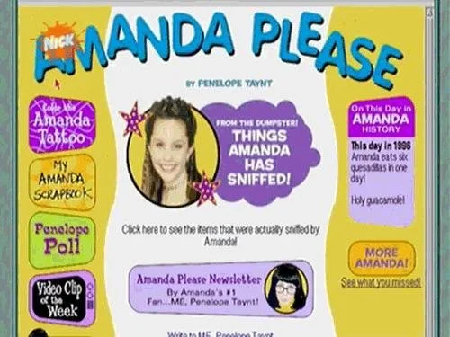
AmandaPlease.com / via Wayback Machine
This idea came to me when I was on Wayback Machine perusing Nickelodeon's glory days – as one does – and I came across the Amanda Please website. The homepage’s title words were rotated at an angle. A subtle touch of dynamism without overwhelming the senses.
Back then, we'd wrangle GIFs and PNGs to achieve this, even JPEGs, sometimes matching the image background to the website – talk about creative workarounds! Nowadays, CSS takes the reins. Not only is it a lot better for accessibility, but CSS doesn't slow down the loading time like a GIF or video would. Plus, you can keep tweaking the angle and editing by touching just one line of code instead of jumping back to Photoshop. Honestly, anything that saves me from endless image exports to get it right is an A+ in my books.
See a live example of rotated text on my portfolio.

Steps:
Go to Design > Custom CSS and copy the snippet.
Determine whether you want to rotate a specific block or section, then find the unique ID.
In the provided code snippet, replace #block-YOUR_BLOCK_ID with the appropriate selector for your element.
The value in rotate(ANGLE) determines the rotation angle. A negative value rotates counterclockwise (left), while a positive value rotates clockwise (right).
/* ROTATE TO THE LEFT */
    #block-YOUR_BLOCK_ID {
    transform: rotate(-8deg);
}

  /* ROTATE TO THE RIGHT */
    #block-YOUR_BLOCK_ID {
    transform: rotate(8deg);
}➌ Glow Effect on Text
Adding a soft, radiant effect to words is a fun way to inject some more of that retro charm. I've sprinkled a few of these glowing gems across my own site.
Steps:
Go to Design > Custom CSS and copy the snippet.
Determine the CSS selector for the text to which you want to apply the glow effect. For instance, you could use these selectors:
Headings: h1, h2, h3, h4
Header Links: .header-nav-item a
Alternatively, you could add a pseudo-class if you only wanted the effect when the user hovers their mouse over the elements. For example, you would use the selector .header-nav-item a:hover to center the glow around the links.
Replace the placeholders YOUR-COLOR-HERE with your chosen hex codes or RGB values.
To adjust the glow size, locate the text-shadow property on the code. This defines the appearance of the glow.
The first two values (0 0) represent the horizontal and vertical offsets of the shadow, which are set to 0 in this case to keep the glow centered around the text.
The third value on the lines 10px and 60px determines the blur radius of the shadow, controlling how spread out the glow appears. A larger value creates a more diffused glow, while a smaller value produces a tighter, more defined glow.
Glow Effect!
/* GLOW EFFECT BY KIMMYBARTLE.COM */
SELECTOR-HERE {
    /* Edit the glow shadow sizes and color as needed */
    text-shadow: 0 0 10px YOUR-COLOR-HERE, 0 0 60px YOUR-COLOR-HERE;
    -webkit-text-shadow: 0 0 10px YOUR-COLOR-HERE, 0 0 60px YOUR-COLOR-HERE;
    -moz-text-shadow: 0 0 10px YOUR-COLOR-HERE, 0 0 60px YOUR-COLOR-HERE;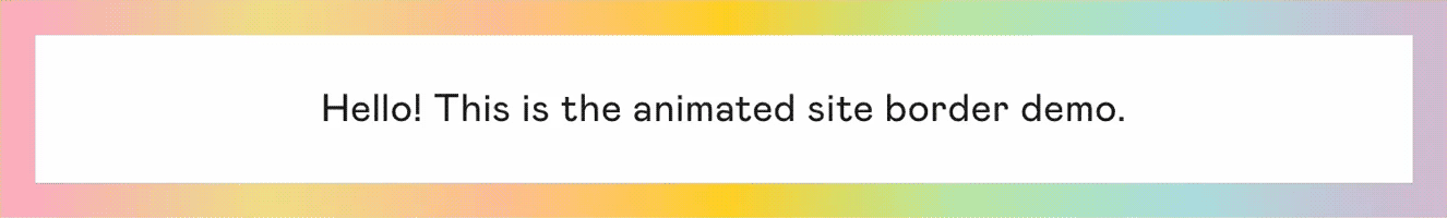
}➍ Rainbow Site Border
I feel site borders really pull things together. It's a simple yet impactful way to frame your content within the browser. I used to spend hours customizing my digital homes with all sorts of borders, including some questionable color combinations. Bright magenta against black... actually, let's not talk about that.
In the code below, I did a pastel take on the bold RGB rainbows that used to prevail back in the 90s and the 2000s. But feel free to adjust to taste. Just remember to keep those neons at bay! Well, unless you're a brutalist at heart, then by all means, use that radioactive Nickelodeon slime green to your heart's content.
Steps:
Go to Design > Custom CSS and copy the snippet.
The rainbow border will now appear around your entire site when viewed on screens with a minimum width of 800px. This ensures the border is visible on desktops but not on mobile devices, enhancing the desktop experience without hindering mobile navigation.
If you're happy with the default rainbow colors, you're all set!
However, if you want to personalize the site border colors, do the following:
Locate the linear-gradient function in the code. It contains a list of HEX codes representing the colors of the rainbow border.
Replace the existing HEX codes with your desired color codes. You can use HEX codes (e.g., #FF0000 for red) or RGB codes for each color.
For RGB codes, use the following syntax: rgb(red_value, green_value, blue_value)
For instance, to represent red using RGB, you would use rgb(255, 0, 0)
Ensure the colors are separated by commas, as shown in the original code.
And one last note, remember to keep the header { border-bottom: none; } line intact to prevent overlapping borders in the header section.
/* RAINBOW SITE BORDER BY KIMMYBARTLE.COM */
  body {
    border: 20px solid;
    border-image: linear-gradient(90deg, #FFC3A0, #FFD700, #B4EEB4, #B0E0E6, #D8BFD8, #FFB6C1, #F0E68C);
    border-image-slice: 1;
  }

/* Don't edit beyond this line! */
  header {
    border-bottom: none;
  }
Hold off on adding the site border until you've finished all your website edits. Squarespace 7.1's Fluid Engine can get a bit finicky with the border in place, so it's best to save this code for the final touch. Once your content and layout are all set, paste it on the last line of code in the CSS editor. This way, it's easy to find and tweak whenever you need to.
And don't forget to stash that code somewhere handy – your desktop, a Google Doc, or Notion are all great options. I personally use Notion to keep track of my CSS snippets.
Want to take it a step further?
➎ Retro Scrollbars
Another favorite of mine. Customizing your scrollbar used to be a badge of honor. A subtle flex that whispered, "Yeah, MySpace and Blogspot taught me how to code." I loved tapping away on my dad’s PowerBook, meticulously replacing the default Safari scrollbar with my own colorful EverythingGirl.com-inspired designs. Of course, sometimes I miss the Mac OS Panther glossy 3D aesthetic. The good news is we can achieve that look, or any look for that matter, by use of shadows and linear-gradient effects.
Scrollbars won't show on mobile. So if you're reading this from your phone, don't be alarmed! There's a reason for this. Traditional scrollbars need mouse input, which you don't get on phones since you scroll sites by swiping your fingers on the screen. A traditional scrollbar wouldn't be intuitive in this case, as it would take too much space and interfere with your browsing experience.
Steps:
Go to Design > Custom CSS and copy the snippet.
To edit the width of the scrollbar, head over to ::-webkit-scrollbar > width.
A larger number means a wider scrollbar. Setting width: 30px; would make it wider than the default.
While a smaller number means a slimmer one. Setting width: 10px; would make it slimmer.
Keep in mind the thumb border size should be either the same or smaller px than the scrollbar width.
To change the track's background color, modify the HEX code value in background-color with a different color code or name, like #fff for white or pink for a, well, pink.
To modify the thumb's color, locate the line that starts with ::-webkit-scrollbar-thumb and find the background-color property. Replace the existing hex code with another color code or color name.
I have a hover effect that changes the thumb's color when the user hovers their mouse over the scrollbar. To modify or remove this effect, locate the line that starts with ::-webkit-scrollbar-thumb:hover and delete that whole section.
/* RETRO SCROLLBAR BY KIMMY BARTLE */
::-webkit-scrollbar {
  width: 20px;
}

::-webkit-scrollbar-track {
  background-color: #f0d9e7; /* LIGHT COLOR */
}

::-webkit-scrollbar-thumb {
  background-color: #ff8a7c; /* BRIGHT COLOR */
  border-radius: 20px;
  border: 6px solid transparent;
  background-clip: content-box;
  transition: background-color 0.3s;
}

::-webkit-scrollbar-thumb:hover {
  background-color: #ff9900; /* BRIGHT COLOR */
}Enjoyed this post?
Contribute to my coding fuel and buy me a Matcha.